↧
Home
↧
Contact Us
↧
↧
About
The idea for OmahPSD came about create a place to collect High Quality PSD resources created by other designer around the world. As a designer and developer, you always looking PSD resources to make your work easier and give you some inspiration. So the site aims to provide you with daily High Quality PSD resources ...
↧
Blog
↧
Five Magical Tips to Better Handle the Typography in Adobe Photoshop

#1. Nothing is magic, everything is experiment
Many designers don’t have enough cool blood to believe that they may also create stunning typography related works. The wrong conception is that other people have so much talent that it is impossible to compare with them. Wrong!!! In any activity field, it isn’t only about talent, the most important is the patience and the concentrated endeavor. Therefore, when working with typography be prepared to “waste” much time just searching for the best font and other similar stuff. The key of success is to experiment…yeah, this idea isn’t very satisfying, but it’s 100% valid!#2. Set up very clearly the purpose of each letter
Another precious tip regarding working with type is to set up very clearly the destination of each letter. In fact, each letter has two different meaning: it’s part of a letter group and represents a specific sound but in the same time it has another sense that is transmitted by its shape. Imagine a poster for kids entertainment that is very nicely realized but the designer use the Verdana font…no matter how warm and kid targeted is the message, the font makes a big discrepancy and the overall result is decent. In conclusion, think twice about each letter you write.#3. The level of discussion: point type and paragraph type
In Adobe Photoshop there are two cases when you effectively work with types. The first one, more used, is point type. That means that all the types used are forming a single line and each letter is easily customized according to the designer preferences. The paragraph type is used when working with big amount of text is required. Creating a paragraph type is very simple, just drag with your mouse the dimensions of the text box you need. It’s very common to use paragraph type when adding text for the content of a layout website (yeah, lorem ipsum dolor or any dummy text). To better handle the paragraph type you may use the Paragraph options. Even if it doesn’t seem too powerful, a good Photoshop use may obtain fabulous effects. Did you know: The options from Paragraph allow the text formatting very similar to the Office Word? Using Paragraph you may align the text according to your preferences: “Right align text”, “Left align text” etc? Adobe Photoshop cares very much about details, in Paragraph setting there is an option called “Roman Hanging Punctuation” that adjust the alignment of quotation marks?

#4. The magic box- Character
Fortunately, when working with types the possibilities of enhancing them are almost limitless. Despite that, there is an entity that has the biggest influence in setting the look of any type- Character. Inside “Character” you are allowed to modify the font used, the size of it, adjust the space between letter or words. Besides these very useful commands, there are some not frequently used adjustments but it’s better to have an idea about. Did you know: Inside “Character” you may create a “Faux Bold” or “Faux Italic” of a font in case it misses the bold and/or italic format? The Character options allow not only modifying the type and the size of the fonts used but also the space between letters, words and lines?#5. The possibilities of Layer styles are almost magic
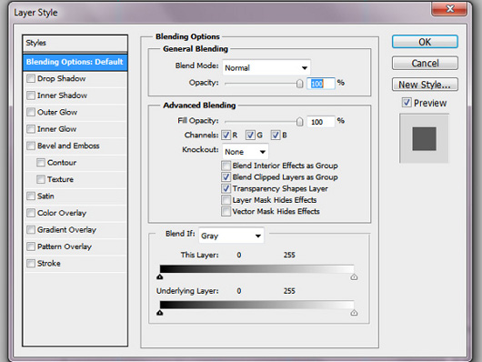 In design projects the letters don’t only help in writing a message, usually they are used to attract viewers. In this case, the designers should find newer and newer ways of enhancing the types used. Clearly, one of the best solutions is to use the magic powers of Layer Styles. It has so many powerful and interesting options that it is impossible not to find a new wonderful combination. It’s just a matter of time and experience. I strongly recommend playing with various combinations of effects; trying is the best teacher in these kind of projects.
Did you know:
You may copy layer styles and paste onto another layer? It’s enough to right click on the effects you like and you will notice an option “Copy Layer Style”. Further, you may go to other layer and paste it.
These are just a few ideas about type…fortunately or not, we have two important news for you, one is positive and the other one is just “half-positive”. The full positive news is that we will give more attention to the type in the next articles, therefore you have a great reason to keep in touch with us. The half-positive idea is that you may read tons of articles about types, fonts and everything related to typography but unless you don’t practice, everything is useless. In conclusion, don’t waste a single day without following a tutorial or trying to do it yourself in order to create a wonderful project!
- Written by Daniel -
In design projects the letters don’t only help in writing a message, usually they are used to attract viewers. In this case, the designers should find newer and newer ways of enhancing the types used. Clearly, one of the best solutions is to use the magic powers of Layer Styles. It has so many powerful and interesting options that it is impossible not to find a new wonderful combination. It’s just a matter of time and experience. I strongly recommend playing with various combinations of effects; trying is the best teacher in these kind of projects.
Did you know:
You may copy layer styles and paste onto another layer? It’s enough to right click on the effects you like and you will notice an option “Copy Layer Style”. Further, you may go to other layer and paste it.
These are just a few ideas about type…fortunately or not, we have two important news for you, one is positive and the other one is just “half-positive”. The full positive news is that we will give more attention to the type in the next articles, therefore you have a great reason to keep in touch with us. The half-positive idea is that you may read tons of articles about types, fonts and everything related to typography but unless you don’t practice, everything is useless. In conclusion, don’t waste a single day without following a tutorial or trying to do it yourself in order to create a wonderful project!
- Written by Daniel -
↧
↧
Quick Tips: Create Pixel Pattern in Photoshop
![]()
STEP 1:
Start with prepare canvas. The canvas can be any size but not less than 10x10 pixels, because our pattern size are not less than 10x10 pixels. In this tutorial I use 100x100 pixels, it will facilitate when "Zoom in" and "Zoom Out". After determining the size, next is click "OK" button.STEP 2:
Enlarge the size of canvas view to the maxSTEP 3:
Create image using "pencil tool",STEP 4:
With the format pencil tool; diameter 1px, brush color black #000000 and opacity 100%,STEP 5:
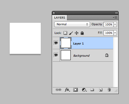
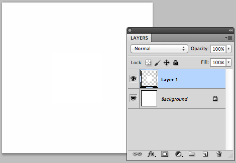
Create a new layer, this layer will be used as a place for our shape pattern later.STEP 6:
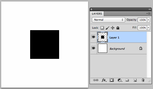
Create image as shown below on the layer that we have create on the STEP 5,STEP 7:
With "Rectangular Marquee tool", create selection like the image belowSTEP 8:
Then crop the image by choosing Menu "Image" and sub mene "Crop",STEP 9:
Click the eye image on the "Background" layer, so that the image we have created on "Layer 1" look transparent,STEP 10:
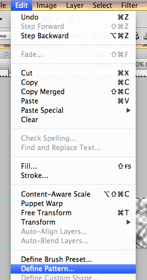
Then create the image to the pattern by choose Menu "edit" and sub menu "Define Pattern",STEP 11:
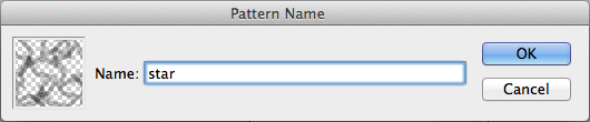
Will appear a tab like the image below, then please write the pattern name and click "OK", that's it your pattern finished.Conclusion
I hope with this quick tutorial will be useful for you, especially for newbie that want to learn web design. Stay tune in the next tutorial, I'll share with you how to create the graphic pattern by using recurrence objects, dont miss it! ^_^)v↧
Six Amazing Tips to Retouch Your Photos

#1. Start with a clear idea, set up a framework
In retouching photos it can’t be an absolute scale to may say, i.e., it’s 90% wonderful and 10% decent, everything is relative. In spite of this complete relativism, no one should abandon the idea of having a clear plan to follow when modifying an image. A professional designer that retouches photos before starting the effective work creates a complete plan to follow and have in his mind a clear idea about how the final result should look. It shouldn’t be complicated, but it must exist. Instead of writing some words on a plain paper I prefer to make a copy of the images to modify and effectively note on it what should be corrected. The images bellow is suffice to better understand my viewpoint.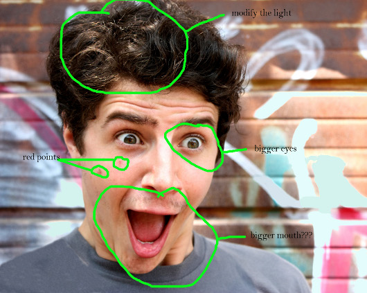
#2. Be very organized
Another mandatory condition to create interesting projects is to be perfectly organized. There is nothing wrong to have more than 100 layers for a single project; imagine how long it will take to find a specific layer when you have to search from “layer 1” to "layer 123"? A better approach is to name them accordingly as "eyes", "upper lips" etc... A professional photo retouch requires much time and it would be highly recommended to reduce the wasted time. It’s simple, you should be more efficient! A great way to save time is to adapt the workplace to your preferences, so start working on it!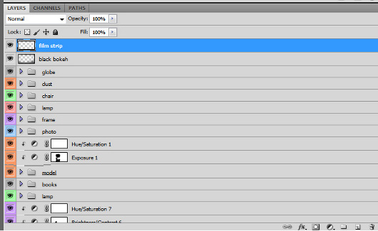
#3. Don’t be hasty- use small steps to achieve a great result
As I previously mentioned, the “huge leaps” don’t exist in retouching photos. Every pixel is important and a good project doesn’t contain “ignored” pixels. Using big brushes, powerful blur effects and large selections are the perfect recipe to fail. It’s true, these save time but the quality will suffer considerably. In conclusion, if you indeed care about your projects don’t hurry to finish them; work on a small scale, zoom in and out until you are convinced that it’s OK then go to the next step.#4. Don’t use your favorite tool, use the suitable one
Every one of us has a favorite technique or tool and it’s quite probable for a designer to use intensively in his projects the respective one. It’s quite normal, isn’t it? Well, in retouching images this fact isn’t a useful approach. No matter by preferences, in retouching images it is mandatory to use the proper tools and not the preferred ones. This situation is obvious when dealing with cloning and sampling tools, you should make a clear difference between them even if you are more accommodated to a single type. By the way, we are on the way of writing a complete guide of explaining each tool from Adobe Photoshop, what do you think, would be it useful to you? Please use the comment form to let us know your ideas.#5. The final image should look nice at both 33% or 330% size
Usually, to modify efficiently a picture it is required to work almost at the level of pixel, zooming in very much. This is a good habit, but lots of designers simply ignore that. In fact, what people really see is the image at its natural size. Many designers didn’t care too much to refine details and the big picture is awful. The conclusion is simple: the final image must look perfect no matter the scale of zoom used!#6. And one more thing...don’t forget to save
It sounds as a silly advice but I am pretty sure that lots of hours were lost just because the user forgets to save his work. Don’t forget…! On the other hand, being a subjective job, I strongly recommend to merely judge your work as objectively as you can. It may happen that you may not to be satisfied with what you have done at the moment and delete all the layers used. This is a grave mistake, the best mentality is to save everything you do and let some time before judging…maybe tomorrow you will have a different idea! Believe me, it really works! I hope the above tips to help everyone interested in retouching photos; it’s only the basis of this difficult job, therefore don’t expect to do miracles if you respect them. The success is dependent of the talent and experience and both of them will continue to develop only when working! You got the point, nothing is achieved without work! - Written by Daniel -↧
13 Amazing iPhone App UI Concept Designs

Medical App by Gabor Jutasi and Daniel Kövesházi

Invoice App by Tomas Zeman
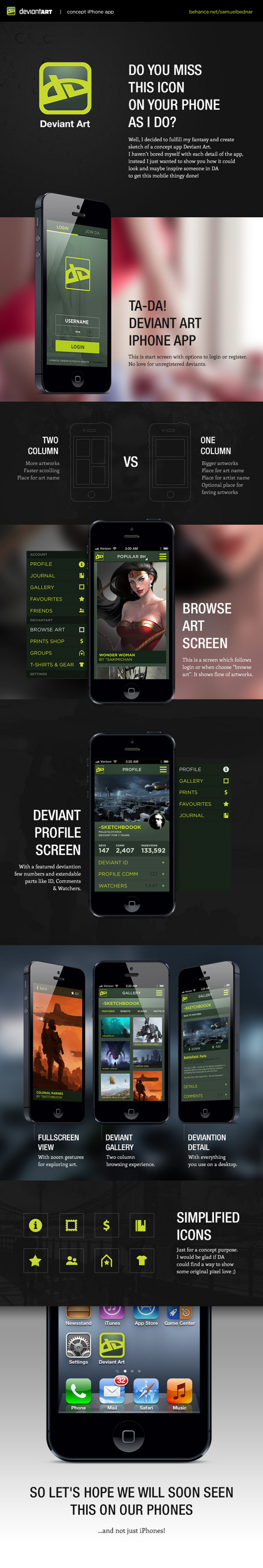
DeviantArt iPhone/Concept App by Samuel Bednár
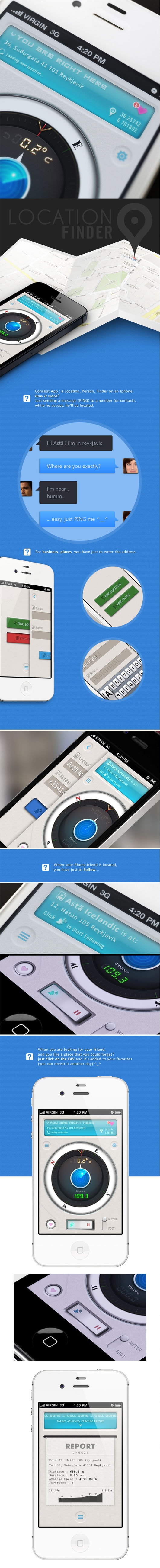
Location Finder iPhone App by Yasser Achachi
Notekall App/Contact List Manager by Michael Nunes

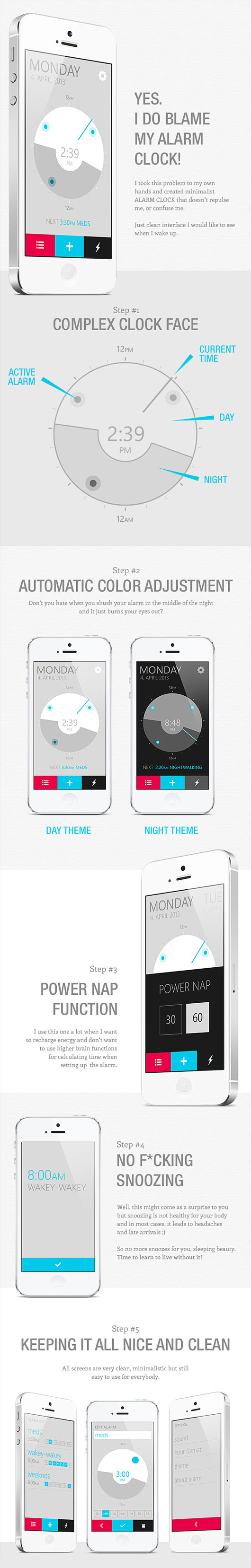
Alarm Clock App by Samuel Bednár
Coffely App by Jakub Antalík

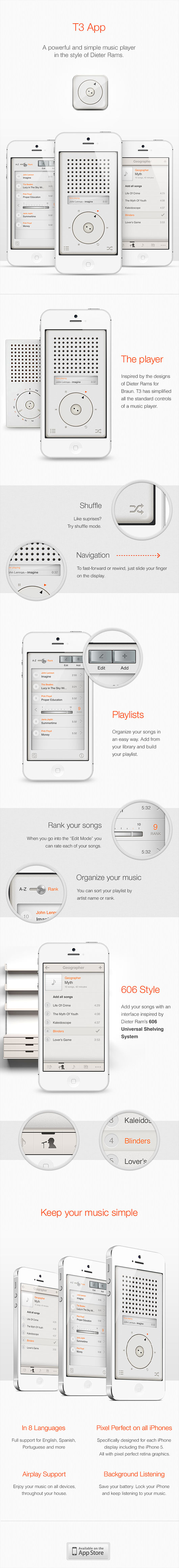
T3 Player App by Eder Rengifo and Bryn Bodayle
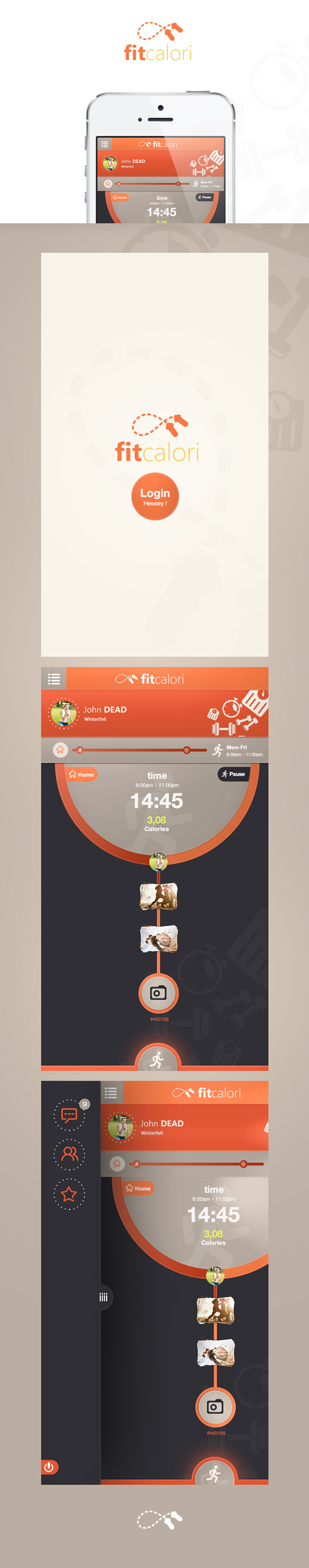
Fitcalori App by Cüneyt SEN
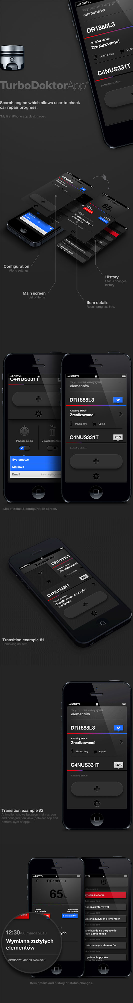
TurboDoktor App by Karol Ortyl
FLOW : : TASKS App by Egor Razzhivin

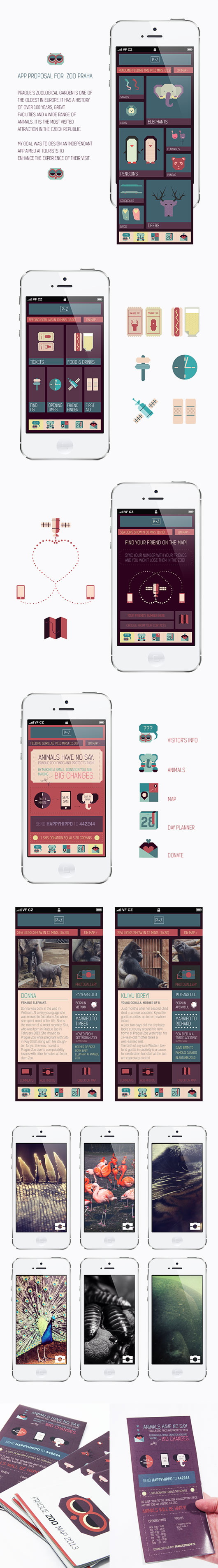
Prague Zoo App by Alina Kotova
Bike Now! App by Radek Skrzypczak
 What’s your favorite App UI concept designs? Do they look out-of-the-box? Do you have another cool iPhone UI designs? Please share with us in the comment below.
↧
Online Resume Design Business Gives Job Applicants a Chance to Shine

 Unfortunately, resume design is a very difficult concept to master, as it requires artistic talent as well as technological know-how in order to incorporate graphics into a written document. That is why businesses such as ResumeBaker.com are now popular choices for would-be job applicants looking to land their dream job. This website offers a unique service where customers simply browse a listing of dozens of designs available for use, choose one, and then upload their text resume to the company's server. After that, experts at ResumeBaker.com will custom typeset each letter of the resume into the new design, ensuring that it not only looks great but is also easy to read.
With ResumeBaker.com, it has never been easier than right now to update your old resume to something more contemporary and visually appealing. They handle every design aspect for you and the turnaround time is usually just a couple of days. While other companies may offer similar services, none can match the breadth of templates available to choose from as well as the professional typesetting service which ensures that each resume looks the very best possible.
When looking for work, you owe it to yourself above all else to develop competitive advantages over other applicants. The design service at ResumeBaker.com is one such advantage which will help to open doors to greater opportunities in the job market. As long as resumes are still reviewed by actual humans, you'll be able to impress upon the hiring professionals your desire to work for their company by presenting to them with a more aesthetically pleasing resume to read. A personal approach is always appreciated, as it shows that at least you've put greater thought into your application than most people, who simply send out dozens of resumes for positions without even reading the details. So distance yourself from the herd and increase your odds of getting hired by utilizing this amazingly affordable service from ResumeBaker.com.
Unfortunately, resume design is a very difficult concept to master, as it requires artistic talent as well as technological know-how in order to incorporate graphics into a written document. That is why businesses such as ResumeBaker.com are now popular choices for would-be job applicants looking to land their dream job. This website offers a unique service where customers simply browse a listing of dozens of designs available for use, choose one, and then upload their text resume to the company's server. After that, experts at ResumeBaker.com will custom typeset each letter of the resume into the new design, ensuring that it not only looks great but is also easy to read.
With ResumeBaker.com, it has never been easier than right now to update your old resume to something more contemporary and visually appealing. They handle every design aspect for you and the turnaround time is usually just a couple of days. While other companies may offer similar services, none can match the breadth of templates available to choose from as well as the professional typesetting service which ensures that each resume looks the very best possible.
When looking for work, you owe it to yourself above all else to develop competitive advantages over other applicants. The design service at ResumeBaker.com is one such advantage which will help to open doors to greater opportunities in the job market. As long as resumes are still reviewed by actual humans, you'll be able to impress upon the hiring professionals your desire to work for their company by presenting to them with a more aesthetically pleasing resume to read. A personal approach is always appreciated, as it shows that at least you've put greater thought into your application than most people, who simply send out dozens of resumes for positions without even reading the details. So distance yourself from the herd and increase your odds of getting hired by utilizing this amazingly affordable service from ResumeBaker.com.
↧
↧
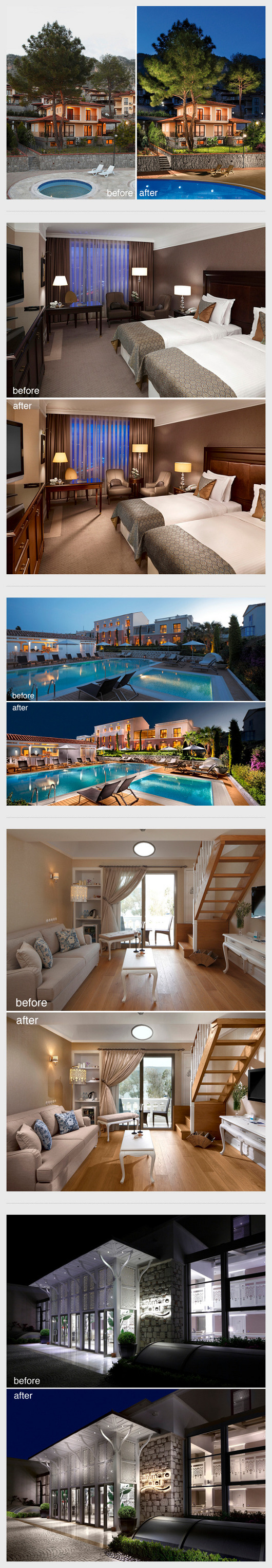
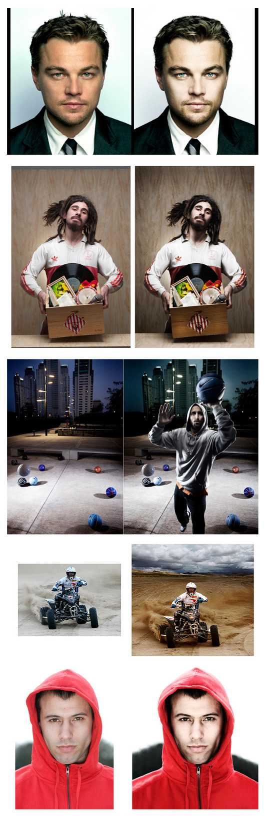
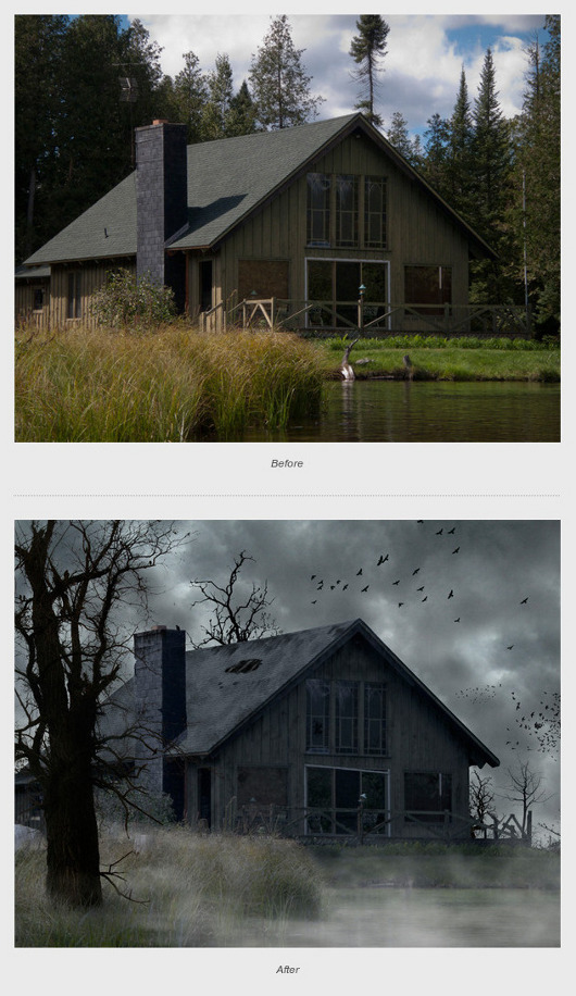
Case Study: Retouching Photos, Art or Science?

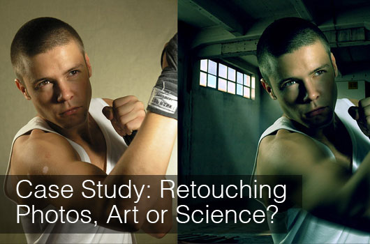 The delimitation between art and science is very superficial and no one may clearly draw the separation line. In spite of that, I insisted in making a clearer separation; I don’t have precise evidence, but, according to my humble judgment, it really works. So, it’s about science when you ask questions using “what” and “which” and art when you ask questions using “how”. It sounds weird, but I will present my deduction and I believe that the majority of you will get my point. From my point of view, retouching photos may be divided into three periods.
#1. Determining the type of project
The designers ignore this aspect and it’s a very BIG, BIG mistake. It’s true that you don’t effectively work and everyone wants to be productive but don’t fall into this trap. Being hasty doesn’t implicate saving time. A better approach is to let the “science part” determine the type of project. Retouching photos is an immense field and each project has its particularities. There are various types of projects: some images simply need some editing and nothing more (e.g. removing the backgrounds of the products from an online store), others need special improvements (e.g. retouching photos for a wedding album) while other images should be totally transformed (e.g. transforming the face of a good-looking girl into a zombie). Of course, there are many others in between situations; in this case it is better to rely more on “science”. Once you established what should be retouched, instantly the next question appears: “how to do it?” Well, here “art” takes the stage. Definitely, this is a very uncertain realm and any advice is relative. The single universal valid advice is to keep working and get inspiration from other talented designers.#2. What should be retouched
Once established the general framework, the next stage supposes to establish which components should be modified. Of course, the pronoun “which” lets you know that we are talking about the science. Yep, at this phase the designer delimitates which aspects must be modified and which not. This is very simple to do: simply duplicate the image to retouch and mark the parts to modify. Not rocket-science, but very efficient. Here is very common a fundamental mistake: even if you can do a specific thing, it isn’t equivalent that you should do it! Yeah, the beginners, especially, fall in love with a specific technique and use it everywhere possible which isn’t good. Keep in mind, if you can, it doesn’t mean that you should! It is about the “science” to determine what should be modified, the “art” consisting in how to effectively do it. To better understand the matter of “art”, you may compare the retouching of pictures with the situation of a producer. You have the know-how, the actors (in our case, the pictures), the screen-play (in our case, the duplicate image where is marked what should be modified) but all these are in vain if the producer doesn’t have the brilliancy of adding all these “ingredients” into a great movie. I hope you got the point!#3. Which commands and effects should be used
This aspect is mostly art related: you have the commands and the effects to apply, it’s quite probable to have some studies in the design field, but you should know how to use each one. In retouching photos, it’s extremely rare to use just a single effect/command, therefore the combination of these is the real secret behind a good retouching. I am sure that amongst the readers, some of them are experts in dealing with images while some are still at the beginning of the career and quite probable, after reading the post, they are in doubt. Well, there is still good news for them: yeah, everyone is able to become a very good expert in this field. The secret recipe is simple, but not very easy to accomplish: practice a lot and get inspiration from the most experienced. In order to complete the post I added here some examples to prove the beauty of retouching- I am a big lover of “Before and After” type of images, so I allowed myself to present some of them. Study carefully the tips above and enjoy the images below!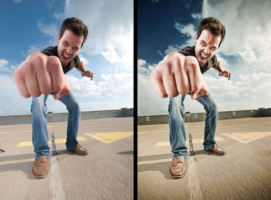
 - Written by Daniel -
↧
20 Best Photoshop Tutorials of June 2013

How to Create Colorful Wooden 3D Text
 by David McLeod
In this tutorial, we will show you how to use Cinema 4D to create wooden 3D text and then how to use Photoshop to add the final touches. Let’s get started!
by David McLeod
In this tutorial, we will show you how to use Cinema 4D to create wooden 3D text and then how to use Photoshop to add the final touches. Let’s get started!
Create a Soil Cake for Pie Charts and Infographics
 by Anton Egorov
In this tutorial, we will show you how to create a soil cake using photographic elements for use in pie charts. Let’s get started!
by Anton Egorov
In this tutorial, we will show you how to create a soil cake using photographic elements for use in pie charts. Let’s get started!
Create a Glowing 3D Text Effect With Filter Forge and Photoshop
 by Rose
In this tutorial, we will show you how to combine Photoshop with Filter Forge to create a glowing 3D text effect. We will begin by showing you how to create basic shapes in Photoshop, we’ll then show you how to convert them to 3D, and finally how to add the final touches using Filter Forge and a few of Photoshop’s basic features. Let’s get started!
by Rose
In this tutorial, we will show you how to combine Photoshop with Filter Forge to create a glowing 3D text effect. We will begin by showing you how to create basic shapes in Photoshop, we’ll then show you how to convert them to 3D, and finally how to add the final touches using Filter Forge and a few of Photoshop’s basic features. Let’s get started!
Poster Mockups in Photoshop
 by Abduzeedo
In this little tutorial I will show you how to create a poster mockup that can be reused for your future poster projects. It's a simple guide on how to use Photoshop Smart Objects to make non-destructive elements in Photoshop.
by Abduzeedo
In this little tutorial I will show you how to create a poster mockup that can be reused for your future poster projects. It's a simple guide on how to use Photoshop Smart Objects to make non-destructive elements in Photoshop.
Super Easy Colorful Effects in Photoshop
 by Abduzeedo
In this tutorial I will show you how to create a nice colorful background using Photoshop. The whole process is pretty simple and straightforward. One good requirement is to understand a little bit of Color Theory in order to create different color combinations.
by Abduzeedo
In this tutorial I will show you how to create a nice colorful background using Photoshop. The whole process is pretty simple and straightforward. One good requirement is to understand a little bit of Color Theory in order to create different color combinations.
How To Create a Lomography Photo Effect in Photoshop
 by Chris Spooner
Follow this step by step Photoshop tutorial to easily give your photos the vibrant characteristics of lomography.
by Chris Spooner
Follow this step by step Photoshop tutorial to easily give your photos the vibrant characteristics of lomography.
Create the Fiery, Dark Photo Manipulation ‘The Last Ride’
 by Orestes Javier
In this tutorial, you will learn how to create a dark photo manipulation featuring a flaming, hell-bound horse.
This tutorial is a staggering 71 steps long and teaches you a huge amount of practical techniques for your wider design work.
by Orestes Javier
In this tutorial, you will learn how to create a dark photo manipulation featuring a flaming, hell-bound horse.
This tutorial is a staggering 71 steps long and teaches you a huge amount of practical techniques for your wider design work.
Quick Tips: Create Pixel Pattern in Photoshop
Create an Abstract Text Effect in Photoshop
 by Alan Kim
In this article we’re going to create an interesting and abstract text effect using layer styles, the fantastic Lens and Optical Flare Collection by daWIIZ and some tricks in the post-production phase. So, let’s start.
by Alan Kim
In this article we’re going to create an interesting and abstract text effect using layer styles, the fantastic Lens and Optical Flare Collection by daWIIZ and some tricks in the post-production phase. So, let’s start.
Creating an Action Movie Poster in Photoshop
 by Roofi Sardar
In this Photoshop tutorial, we are going to create a simple action movie poster using pre-existing images. We will be working with Filters, blend modes and adjustment layers.
by Roofi Sardar
In this Photoshop tutorial, we are going to create a simple action movie poster using pre-existing images. We will be working with Filters, blend modes and adjustment layers.
Vintage Tiles Text Effect
 by textuts
This tutorial will show you how to create some letters, convert them to shapes, exclude them from rounded rectangles, then apply a simple layer style to create lovely vintage looking tiles. Then, a nice action will be applied to enhance the coloring of the final result.
by textuts
This tutorial will show you how to create some letters, convert them to shapes, exclude them from rounded rectangles, then apply a simple layer style to create lovely vintage looking tiles. Then, a nice action will be applied to enhance the coloring of the final result.
Elegant Glossy Gold Text Effect
 by textuts
This tutorial will show you an easy way to create a luxurious super glossy golden text effect using layer styles, a filter, and a simple brush.
by textuts
This tutorial will show you an easy way to create a luxurious super glossy golden text effect using layer styles, a filter, and a simple brush.
Quick Tip: How to Make Apple WWDC Logo in Adobe Photoshop CS5
Create Unique 3D Grass and Stone Text Effect in Photoshop CS6 Extended
 by PSD Vault
In this tutorial, I will show you the steps to Create Unique 3D Grass and Stone Text Effect in Photoshop CS6 extended. We will explore the use of the 3D functions to create this interesting text effect. We will also go through some texturing techniques and filter effects.
by PSD Vault
In this tutorial, I will show you the steps to Create Unique 3D Grass and Stone Text Effect in Photoshop CS6 extended. We will explore the use of the 3D functions to create this interesting text effect. We will also go through some texturing techniques and filter effects.
Design “Lady Holding a Fire Orb” Photo Manipulation in Photoshop
 by PSD Vault
In this tutorial, I will show you the steps to”Lady Holding a Fire Orb” Photo Manipulation in Photoshop. We will mainly explore some interesting methods of applying texture, selection techniques, as well as layer blending options.
by PSD Vault
In this tutorial, I will show you the steps to”Lady Holding a Fire Orb” Photo Manipulation in Photoshop. We will mainly explore some interesting methods of applying texture, selection techniques, as well as layer blending options.
How to Create a Night Jungle Scenery in Photoshop
 by Dek Wid
This tutorial will show you how to creatively create your own jungle background, manipulate a stone building into a tower, and add doors to create a miniature village for fairies.
by Dek Wid
This tutorial will show you how to creatively create your own jungle background, manipulate a stone building into a tower, and add doors to create a miniature village for fairies.
Create a Pixel-Perfect Notebook Icon in Photoshop
Combine a Crocodile with a Car to Create an Exotic Crocomobile
 by Loredana Papp
This is a simple tutorial but to get great results, you'll need some patience, an eye for details, and some imagination. Read this tutorial and find out how you can easily create your own animal-vehicle creation in Photoshop.
by Loredana Papp
This is a simple tutorial but to get great results, you'll need some patience, an eye for details, and some imagination. Read this tutorial and find out how you can easily create your own animal-vehicle creation in Photoshop.
Quick Tip: Doll Cam Photo Effect in Photoshop
 by Slingshut
In this article, you'll learn how to create Doll Cam effect in your photo using photoshop.
by Slingshut
In this article, you'll learn how to create Doll Cam effect in your photo using photoshop.
Create a Typography Wallpaper with 9 Different Text Effects Styles in Photoshop
 by Adrien de Broglio
In this tutorial, you'll learn how to create a Typography Wallpaper with 9 Different Text Effects Styles in Photoshop. we’ll use a lot of different Layer Styles, Layer Masks, Textures and a few Filters.
by Adrien de Broglio
In this tutorial, you'll learn how to create a Typography Wallpaper with 9 Different Text Effects Styles in Photoshop. we’ll use a lot of different Layer Styles, Layer Masks, Textures and a few Filters.
↧
What Should You Know About Flat Design

#1. No gradients, highlights, shadows- nothing to shine
As I already mentioned, flat design removes any idea of three dimensions…everything has only length and width. In addition of that, everything that shines is replaced. There is no flat design that has gradients, highlights or shadows…the idea is to let the content speak for itself. Recently, a new direction was embraced, especially by Google: almost flat design. It respects the basic features of flat design, but in order to emphasize some capital elements are added some light effects. The results are pretty cool! Below are some examples, enjoy them!

#2. Vivid colors
Having a shiny button isn’t necessarily a bad fact: it’s a modality to attract the eyes of the viewers and it’s quite important in the overall success of a website. The flat design supposes to renounce to these possibilities, therefore the designers must find other solutions. One of the possibilities of catching the viewers’ attention is to use the vivid colors and for a flat design it’s almost a must to use these color combinations.#3. The typography is “the new king”
Previously, the nice layout designs grabbed the viewers’ attention and somehow the content was put into the shadow. Flat design has the great benefit that gives back to the typography its major role. If you neglected the typography then you should come back to the roots and play smartly with the fonts.#4. Almost everywhere are boxes
Another common element of flat style is the use of boxes…the prototype is clear: a rectangle with without rounded corners, usually painted in vivid colors and having a message using a bold font. By sure, the examples below will make you a better idea about.

#5. Simple elements
It’s easy to mistake flat design for minimalism but these are two different concepts. Flat design uses simple elements, noting complicated and lets the content speak for itself (content before chrome). Minimalism supposed to reduce everything to strictly necessary and nothing more. We may have a full flat layout that is built from simple elements – clearly, it’s not about minimalism here! It’s pretty normal to ask yourself if flat is just a passing trend or something that will resist in the art of crafting websites. Should everyone pay attention to flat solutions? Well, everyone that has a sure answer is totally wrong. The web design world is changing with an amazing rate and we hardly keep the same rhythm. On my humble opinion, flat design isn’t a new discovery- it’s just a “rebranding” and it will be on trend for some years and I am sure it will have the fate of skeuomorphism. The users will be annoyed by so many flat layouts and will ask for something different. Anyway, the idea is that any web designer should pay closer attention to flat approach and create websites with flatness in mind. What should every designer keep in his mind is that flat isn’t a general solution- it might be suitable for some projects and not a good idea for others. No matter that flat is hot; the designer must put everything in balance and according to it, to make a decision. The conclusion is simple and effective: go for flat, but don’t make it obsessively! On the other hand, don’t consider flat as being just a fade- it has some major advantages and you should benefit from:#1. Simple and loved
Flat design is simple both for users- they aren’t disturbed by any other items but it’s simpler also for designers than other styles and they may focus more on content. The great news is that people love flatness, therefore ask your clients for a flat solution- they may fall in love with it.#2. Responsive
The desktop computers are “already old” and many people use the new gadgets to access the Internet: a non-responsive website has a slight chance of being enjoyed by the users, therefore responsiveness isn’t a fade,it is just a sign that you care about your online presence or your business. Flat design is very suitable for mobile browsing- the big boxes allow everyone to select the desired action. The small buttons that can’t be touched and annoyed every user are history!#3. Focus on content
It was previously mentioned, but its importance made me treat apart. Many of us forgot or neglected that content is the most important and a design remains a design. Flat design is an approach that lets the users enjoy the content and it’s awesome. You visit a website for information and not for a shiny button, isn’t it? In the end, I hope that the next examples will delight your eyes and why not, will make you to take flat design into consideration!


 [caption id="attachment_2324" align="aligncenter" width="530"]
↧
12 Useful Infographics to Improve Your Photoshop Knowledge

Crooked Stats Infographic Kit
[caption id="attachment_2392" align="aligncenter" width="530"]The Evolution of Photoshop Infographic

What's new in Photoshop CS6? [infographic]

CS6 Shortcut Cheatsheet [Infographic]

The Darwinian Evolution of Photoshop [Infographic]

Adobe InDesign, Illustrator & Photoshop - Infographic

Advanced Photoshop Magazine [Infographic]

Photoshop Keyboard Shortcuts [Infographic]

The Photoshop Family: Understanding The Adobe Family Tree [Infographic]

Design Wars of Popular Graphic Software [Infographic]

iOS App Designer Guide to Developer Love [Infographic]

A Visual History of Design Tools [Infographic]

The 20 Most Popular Design Tools and Their Users [Infographic]

↧
↧
11 Amazing Android App UI Designs

Viber Android App Redesign by Moe slah


Reverb - Android Music Playe by Asgar khan

SoundCloud Android App Redesign by Ramy Adel

Whatsapp Android App Redesign by Moe slah


Simple Note App for Android by Codebuild


Dribbble.com Android App UI Design by Moe slah


Four Shared App Redesign by Sam Hall


Social Launcher for Android by Iluha tsuprun


tramTRACKER®, Android by Mike Thomas
Weather Forecast Mobile App by Saulius Kirklys

Rage Amp - Music Player for Android Tablets by Rafal Kaczmarek

↧
How to Create Web Pattern with Custom Shape in Photoshop

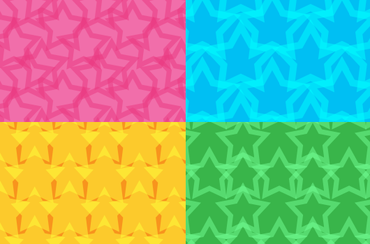
STEP 1: Create a New File
I'll use new file with canvas size 100x100px and set the resolution to 72 ppi.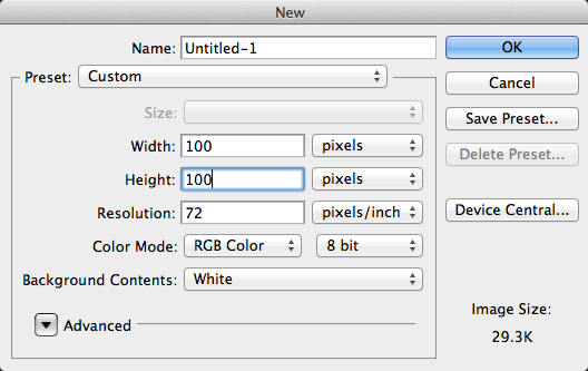
STEP 2: Duplicate the Background Layer
With [command] + J or menu "Layer"-"New"-"Layer via Copy" we'll duplicate the background layer. We will use this layer for create some guides and crop the canvas later.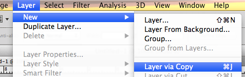
STEP 3: Resize the Canvas
Resize the canvas with menu "Image"-"Canvas Size". Then resize to 300x300 pecent.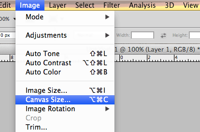

STEP 4: Invert the Layer
For visualable "layer 1" so I'll invert the color of this layer to Black/Dark color with [command]+I or menu "Image"-"Adjustments"-"Invert"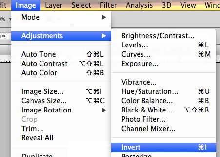
STEP 5: Create Some Guides
Click your mouse at the rulers and drag to every side of the "layer 1"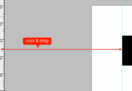
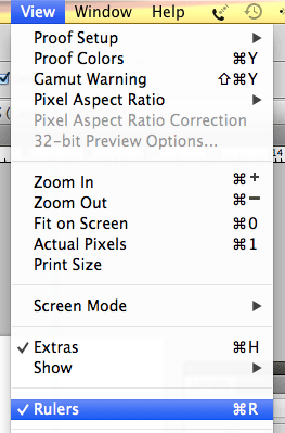
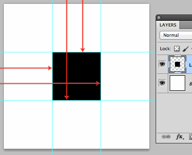 If your rulers didn't show up, you can give a check at menu "view"-"Rulers"
STEP 6: Hide the Layer
Hide layer "Layer 1" with click the eye picture at the left box from "Layer 1"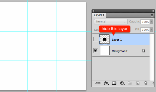
STEP 7: Create Custom Shape
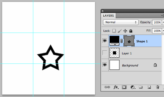
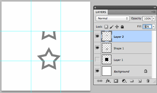
Click "Shape Tool" from sidebar then select "Custom Shape Tool", set the color "#000000" and click "Shape", choose "Star Frame"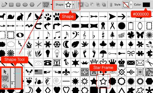 Put the star shape on canvas, as shown below
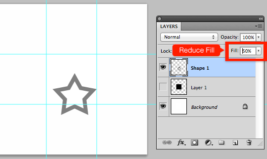
STEP 8: Rasterize & Reduce Fill the Layer
Right click on the shape layer and the choose "Rasterize Layer"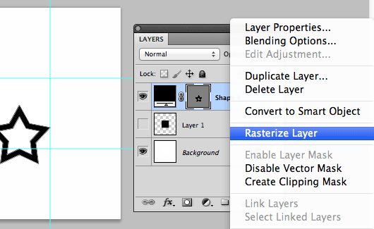 Reduce fill the layer "Shape 1" into 50%
STEP 9: Copy & Paste the Layer
With "Rectangular Marquee Tool" from sidebar, copy the intersection betwen the and guide, as shown below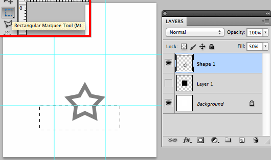 Then paste and place it exactly as the intercepts, like the image below
STEP 10: Add Another Shape
Duplicate the "Shape 1" and put where ever you want and remember to copy the intersection shape and guide like on "STEP 9"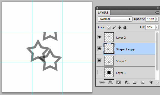
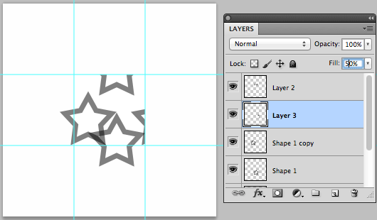 And this's my result
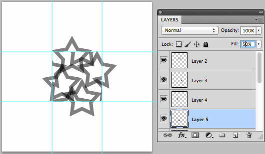
STEP 11: Selection the Layer
Selection of the center canvas, by directing the mouse on the layer "layer 1" and press [command] button + [left click pada mouse]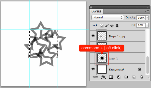
STEP 12: Crop Canvas
After the selection, then crop the canvas by select menu "Image"-"Crop"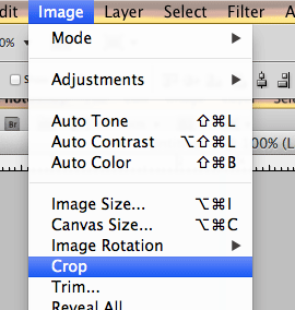
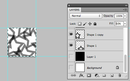
STEP 13: Define Pattern
Now I'll define this picture to be pattern but first I'll hide layer "Background" and then define pattern with menu "Edit"-"Define Pattern…"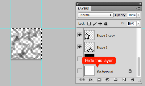
 Give the pattern name then pres button [OK]
 So here is the Final Results:

Conclusion
I hope you have learned useful things from this simple and easy photoshop tutorial. Thanks for completing the tutorial and keep practicing. Stay tune with our next tutorials...↧
22 Best Photoshop Tutorials of July 2013

Create a Flat Countdown Timer in Photoshop – iOS 7 Inspired
 by Michael John Burns
In this tutorial I am going to show you how to create a simple countdown timer, iOS 7 inspired! This tutorial will be very quick and beginners will find this Photoshop tutorial helpful in understanding the power of Free Transform.
by Michael John Burns
In this tutorial I am going to show you how to create a simple countdown timer, iOS 7 inspired! This tutorial will be very quick and beginners will find this Photoshop tutorial helpful in understanding the power of Free Transform.
Flat Web Design Tutorial – Portfolio Landing Page
 by Michael John Burns
Today I will teach you how to design a portfolio landing page. Almost an hour long free video tutorial!
by Michael John Burns
Today I will teach you how to design a portfolio landing page. Almost an hour long free video tutorial!
Inspired by Oregon - Photoshop Tutorial
 by Abduzeedo
So in this tutorial I will walk you through the process behind my Inspired By Oregon artwork.
by Abduzeedo
So in this tutorial I will walk you through the process behind my Inspired By Oregon artwork.
Tutorial/Case Study 'Like a Bird' by Vigan Tafili
 by Vigan Tafili
Today we're going to show a interesting case study from our buddy Vigan Tafili aka. Nagivity. It's a really beautiful digital art concept that I hope you guys like it.
by Vigan Tafili
Today we're going to show a interesting case study from our buddy Vigan Tafili aka. Nagivity. It's a really beautiful digital art concept that I hope you guys like it.
Beautiful Water Effect in Photoshop CC
 by Abduzeedo
So for this tutorial I will show you how to create a really cool effect with water texture and the displace filter.
by Abduzeedo
So for this tutorial I will show you how to create a really cool effect with water texture and the displace filter.
How to Create Web Pattern with Custom Shape in Photoshop
 by Yahya
In this tutorial I will show you How to Create a Web Pattern in Photoshop using basic vector shape. So let’s get started!
by Yahya
In this tutorial I will show you How to Create a Web Pattern in Photoshop using basic vector shape. So let’s get started!
Create a "Middle-Earth" Inspired Landscape in Photoshop
 by Sheridan Johns
In this tutorial, we will show you how to create a lush and vibrant "Middle-Earth" inspired landscape in Photoshop. Let’s get started!
by Sheridan Johns
In this tutorial, we will show you how to create a lush and vibrant "Middle-Earth" inspired landscape in Photoshop. Let’s get started!
How to Create a Panorama Using Photoshop and Lightroom
 by Martin Perhiniak
In this tutorial, we will show you a seamless workflow for creating a panoramic photo using both Photoshop and Lightroom. We will begin by selecting several photos in Lightroom, we will then show you how to merge those photos together in Photoshop, and finally, we will show you how to apply some adjustments to the final image in Lightroom. Let’s get started!
by Martin Perhiniak
In this tutorial, we will show you a seamless workflow for creating a panoramic photo using both Photoshop and Lightroom. We will begin by selecting several photos in Lightroom, we will then show you how to merge those photos together in Photoshop, and finally, we will show you how to apply some adjustments to the final image in Lightroom. Let’s get started!
Create a Cute Zombie Illustration in Photoshop
 by Liran Szeiman
In this tutorial, Liran Szeiman will show you how to create a cute zombie illustration that might be more appropriate for less mature audiences. This tutorial also includes a speed painting video that demonstrates the entire process. Let’s get started!
by Liran Szeiman
In this tutorial, Liran Szeiman will show you how to create a cute zombie illustration that might be more appropriate for less mature audiences. This tutorial also includes a speed painting video that demonstrates the entire process. Let’s get started!
Create a Heart-Warming Wildlife Illustration in Photoshop
 by Therese Larsson
In this tutorial, Therese Larsson will show you how to create a heart-warming wildlife illustration using a variety of digital illustration techniques. Let’s get started!
by Therese Larsson
In this tutorial, Therese Larsson will show you how to create a heart-warming wildlife illustration using a variety of digital illustration techniques. Let’s get started!
Create a World War II Era Dogfighter
 by INK
In this tutorial, our friends at INK will show you how to create a furry World War II era aircraft, that we are calling a “dogfighter” using a handful of photos and a 3D model. Let’s get started!
by INK
In this tutorial, our friends at INK will show you how to create a furry World War II era aircraft, that we are calling a “dogfighter” using a handful of photos and a 3D model. Let’s get started!
Create a Textured Wooden Text Effect Using Photoshop’s 3D Capabilities
 by Orestes Javier
Today you’ll learn how to create a simple wooden text effect using some practical, 3D and texturing techniques in Photoshop CS6 Extended. Don’t worry if this is your first time working with 3D design, I’ll hold your hand through every step along the way!
by Orestes Javier
Today you’ll learn how to create a simple wooden text effect using some practical, 3D and texturing techniques in Photoshop CS6 Extended. Don’t worry if this is your first time working with 3D design, I’ll hold your hand through every step along the way!
Learn how to create Iron Text Effect in Photoshop
 by Roofi Sardar
In this tutorial, you are going to learn how to create my rendition of iron text in Adobe Photoshop. The end result is this old-looking, strong, armor-ish text that just might give you a vague feeling of having seen it somewhere before.
by Roofi Sardar
In this tutorial, you are going to learn how to create my rendition of iron text in Adobe Photoshop. The end result is this old-looking, strong, armor-ish text that just might give you a vague feeling of having seen it somewhere before.
Create Melted Metal Text Effect in Photoshop
 by PSDVault.com
In this tutorial, I will show you how you can create this melted metal text effect in Photoshop.
by PSDVault.com
In this tutorial, I will show you how you can create this melted metal text effect in Photoshop.
The Creation Process of “Urbanized” Photo Manipulation in Photoshop
 by PSDVault.com
In this tutorial, I will show you the process of creating this “Urbanized” photo manipulation in Photoshop.
by PSDVault.com
In this tutorial, I will show you the process of creating this “Urbanized” photo manipulation in Photoshop.
Create Facial Photo Manipulation Surrounded by Electrified Orbs in Photoshop
 by PSDVault.com
In this tutorial, I will show you the process of creating this Create Facial Photo Manipulation Surrounded by Electrified Orbs in Photoshop.
by PSDVault.com
In this tutorial, I will show you the process of creating this Create Facial Photo Manipulation Surrounded by Electrified Orbs in Photoshop.
Create a Mysterious Scene with Planets
 by Guilherme Pejon
In this detailed tutorial, you'll learn how to create a surreal landscape, add a mysterious glowing light, and finish it with trees and a family in the foreground.
by Guilherme Pejon
In this detailed tutorial, you'll learn how to create a surreal landscape, add a mysterious glowing light, and finish it with trees and a family in the foreground.
How to Turn an Ordinary Landscape into a Dramatic Moonscape
 by Jarka Hrnčárková
In this tutorial you’ll learn how to transform ordinary photo into a dramatic landscape by adding different light sources, creating depth and changing color schemes. Let’s get started.
by Jarka Hrnčárková
In this tutorial you’ll learn how to transform ordinary photo into a dramatic landscape by adding different light sources, creating depth and changing color schemes. Let’s get started.
Designing a Beautiful Business Card in Photoshop
 by Alex
No matter who you are, if you are doing business of some sort, chances are, at some point you will need business cards. And this business card tutorial covers, designing a simple, modern business card template in Photoshop.
by Alex
No matter who you are, if you are doing business of some sort, chances are, at some point you will need business cards. And this business card tutorial covers, designing a simple, modern business card template in Photoshop.
Quick Tip: Create a Seamless Pattern in Photoshop
 by Ainsley Bevis
In this Quick Tip I'll be showing you how to create a Seamless Pattern in Photoshop, we'll be using some basic methods and techniques with this Seamless Pattern Tutorial.
by Ainsley Bevis
In this Quick Tip I'll be showing you how to create a Seamless Pattern in Photoshop, we'll be using some basic methods and techniques with this Seamless Pattern Tutorial.
Create 5 Subtle Background Patterns in Photoshop
 by Ainsley Bevis
In this article, we'll teach you how to create 5 Subtle Background Patterns in Photoshop. These short tutorials of Subtle Background Patterns in Photoshop are great for beginner and intermediate users, I'll be going through simple step by step instructions, I hope these quick Photoshop Pattern Tutorials help you out.
by Ainsley Bevis
In this article, we'll teach you how to create 5 Subtle Background Patterns in Photoshop. These short tutorials of Subtle Background Patterns in Photoshop are great for beginner and intermediate users, I'll be going through simple step by step instructions, I hope these quick Photoshop Pattern Tutorials help you out.
Create a Clean Website Layout PSD to HTML/CSS Part 1 [Tutorial]
 by Ainsley Bevis
In this Part 1 tutorial we'll be creating a Minimalist and Clean Website Layout in Adobe Photoshop. This Website Layout is suitable for Business and Portfolio purposes and will help you build up your skills when creating Photoshop layouts.
by Ainsley Bevis
In this Part 1 tutorial we'll be creating a Minimalist and Clean Website Layout in Adobe Photoshop. This Website Layout is suitable for Business and Portfolio purposes and will help you build up your skills when creating Photoshop layouts.
↧
Flat Calendar Widget (PSD)


Free Download
Feel free to download this Calendar Widget (PSD), here: [download id="2661"]↧
↧
20+ Amazing Mobile App Landing Pages for Your Inspiration

Incredible - The ultimate App landing page

BootStarter - Bootstrap Parallax One Page Landing Page

NYC Bike App Layout

M.dot App

Picture of the Day App

PassLocker

Starcount App Landing Page

AllSnow Homepage

Web for iPad App called RealPad

Invy App Landing Page

Yahoo Weather

Riverstone Apps Home Page

Listn Beta OUT NOW! + New Splash Page

Cinematic iPhone App - Landing Page

Kelvin Weather iPhone App Web Page

Coffely Landing Page

Taasky Landing Page

Starmatic - Rediscover Photography

Hipstamatic - Oggl

Over - Add Beautiful Text to Your Photos
Analytiks - Google Analytics iPhone app, iOS Stats Made Beautifully

Smartphood

syPhone 2 - The Best iPhone Experience with syPhone
SpellRush - The Free Word Game for iPhone and iPod Touch
VSCO CAM Visual Supply Co

Hy, How Much Water Did You Drink Today

↧
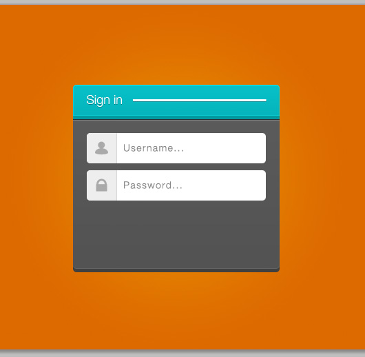
How To Design a Simple Login Form in Photoshop

Tutorial Details:
- Program: Adobe Photoshop
- Difficulty: Beginner
- Estimated Completion Time: 45 minutes

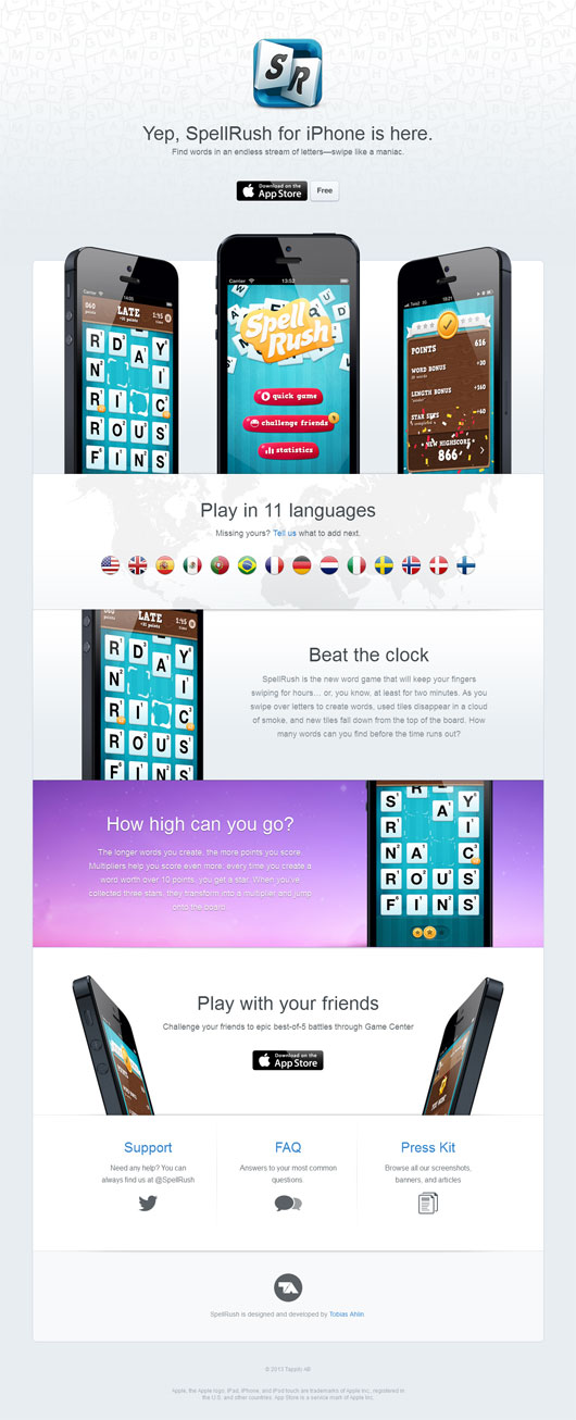
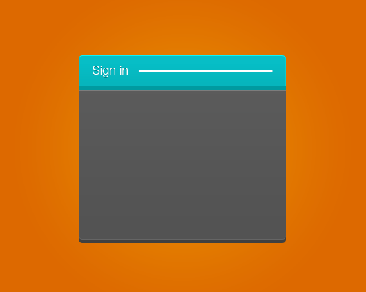
Step 1:
Create a new file, Open menu 'File' -> 'New'. And set Width: 300px, Height: 267px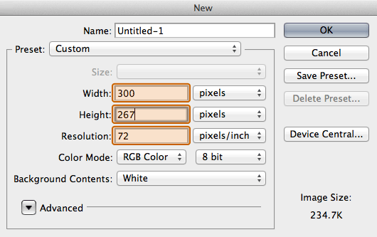
Step 2:
Show rulers by choosing menu 'View'->'Rulers'. Then change the Ruler unit to Pixel by Right-click on the Rulers with your mouse.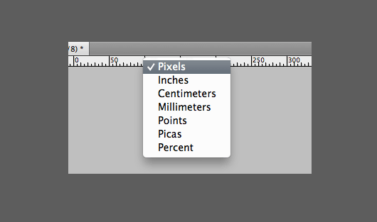
Step 3:
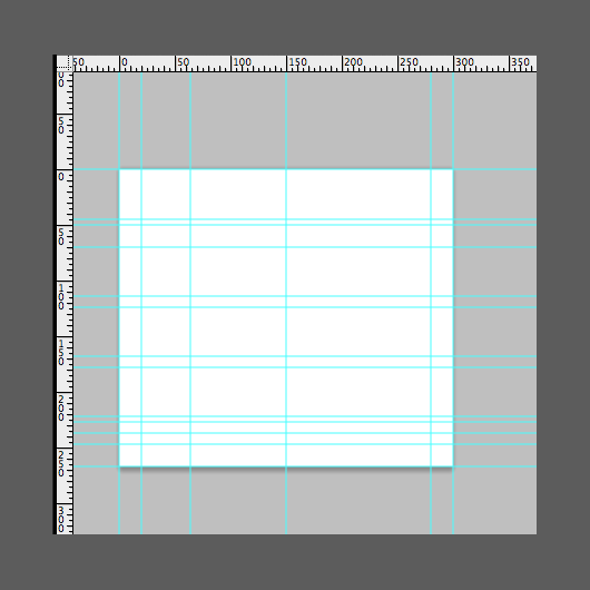
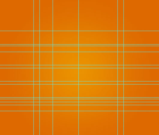
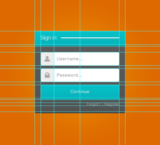
Create guide with choose menu 'View'->'New Guide'. Check 'Vertical' and fill position to '0px' and then click 'OK' Do it again and fill this:
Vertical: 20px,64px,150px,280px, 300px.
Horizontal: 0px,45px,50px,70px,114px,124px,168px,178px,222px,227px,237px,247px 267px
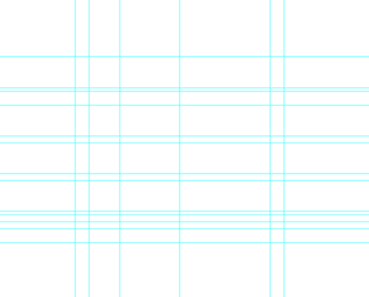
If you do like I do, the result would look like this
Do it again and fill this:
Vertical: 20px,64px,150px,280px, 300px.
Horizontal: 0px,45px,50px,70px,114px,124px,168px,178px,222px,227px,237px,247px 267px
If you do like I do, the result would look like this
Step 4:
Now after we create the guide, resize the canvas with choice menu 'Image'->'Canvas size' set width to 600px and height to 500px.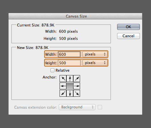
Step 5:
Double click on layer Background. Change the name of the layer to "background"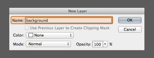
Step 6:
Pick 'Paint Bucket Tool' and choose color #dd6800 from side tool box. And paint it to the canvas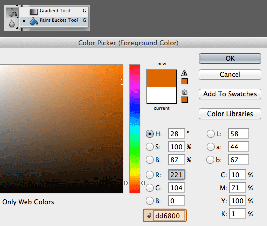
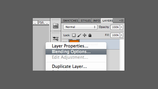
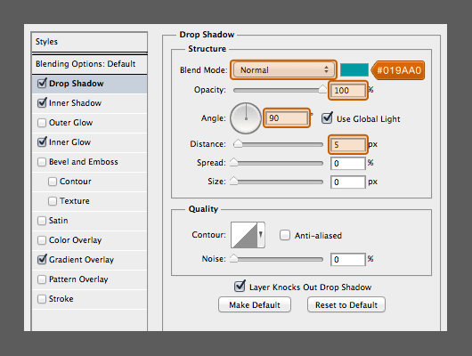
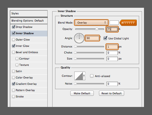
 Right-click on the layer "Background" with your mouse and choose 'Blending Options'
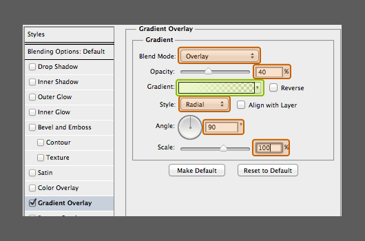
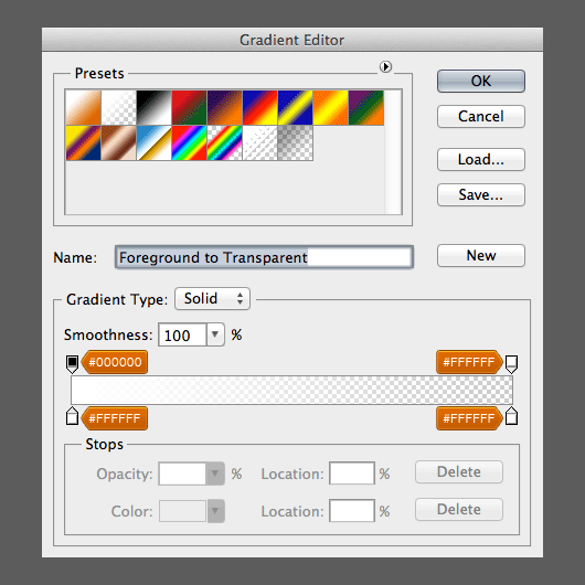
 Choose 'Gradient Overlay' and apply this layer style
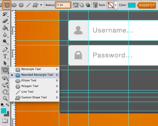
Step 7:
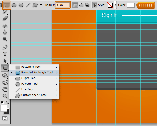
Create object with 'Rounded Rectangle Tool' with radius: 5px and color: #5C5C5C.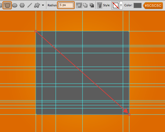 Apply the following layer style to the layer “Shape 1”

Step 8:
Create a new group and name it "Header"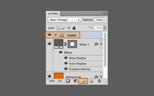 Create object with 'Rounded Rectangle Tool' with radius: 5px and color: #06BFC7, like in the picture below
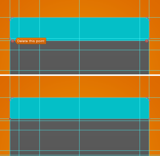
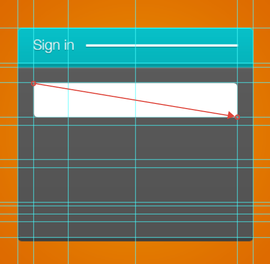
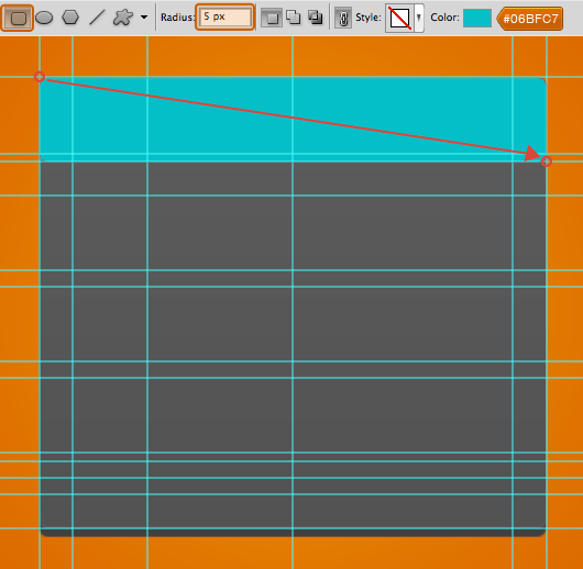 With 'Pen Tool' delete the point like in the picture
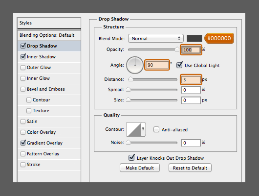
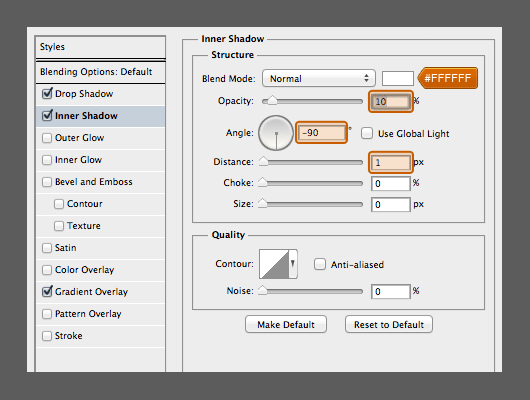
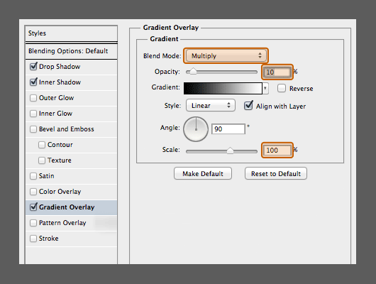
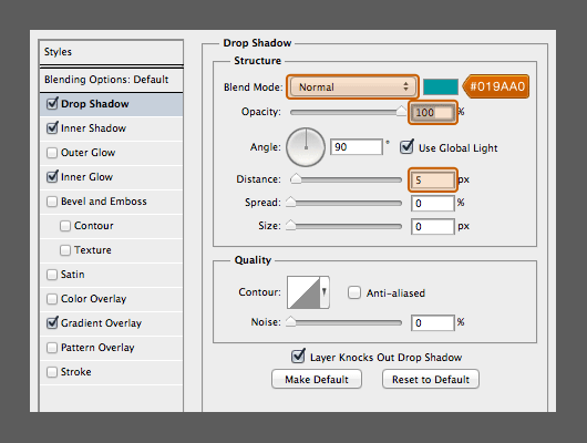
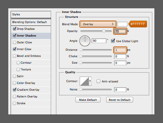
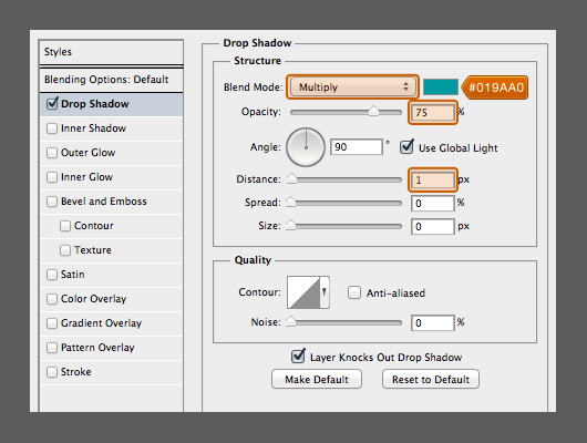
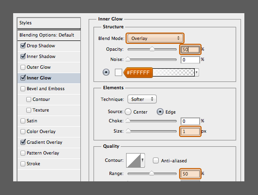
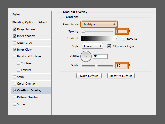
 Apply the following layer style to the layer


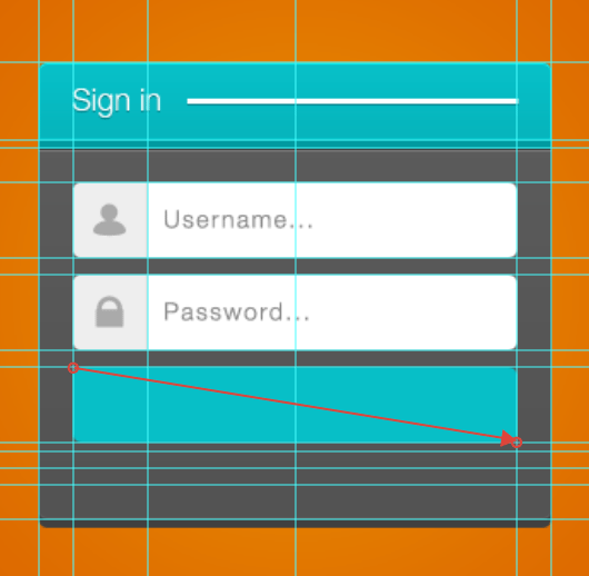
Step 9:
Create a text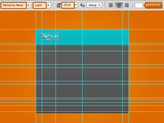 Apply the layer style to the text

Step 10:
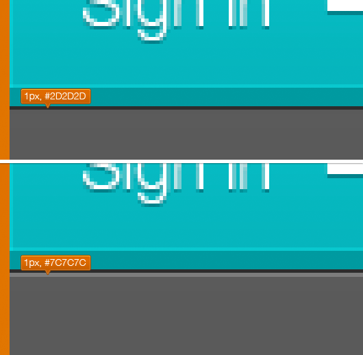
Create line beside the text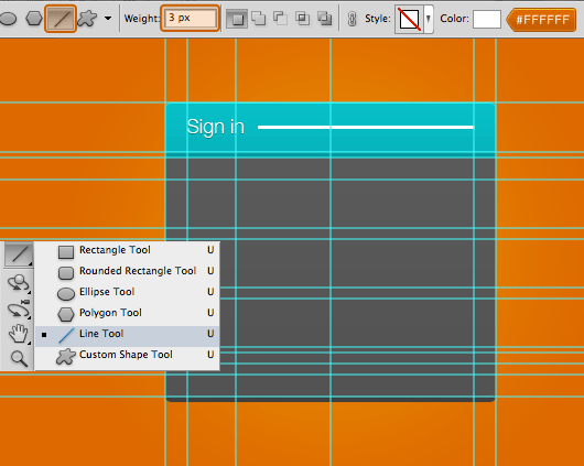 Apply the layer style to the line
Step 11:
At the bottom of the Header create line with pencil. First create a new layer and then pick Pencil Tool at tool box on side bar
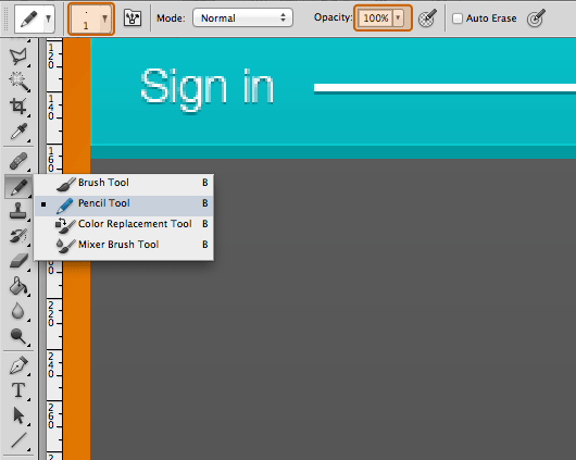
Step 12:
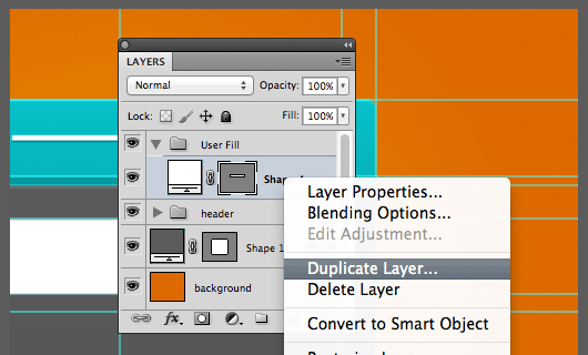
After finish with the header, now create a new group and name it with "User Fill".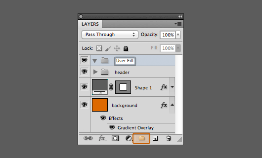 Create object with 'Rounded Rectangle Tool' with radius: 5px and color: #FFFFFF
 Duplicate the object and change the colour to #EEEEEE
 With 'Pen Tool' delete and move some point like the picture below
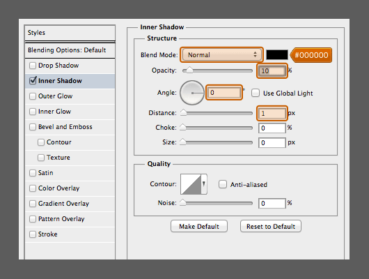
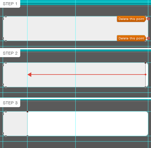 Apply the layer style to the object
 Add icon and text
 Here I have prepare this small icon in vector object for you to use ([download id="2826"])
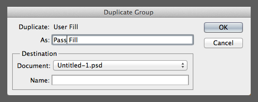
Step 13:
Step 13 is almost the same as in Step 12. Or if you wanna make it quick just dupilcate group "User Fill"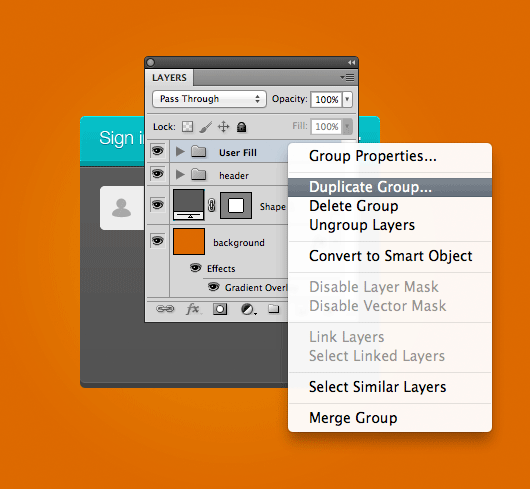 Change the group name to "Pass Fill"
 Change the icon and the text
Step 14:
Create a new group and name it with "Button"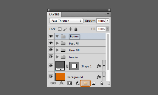 Create object with 'Rounded Rectangle Tool' with radius: 5px and color: #06BFC7
 Apply the following layer style to the layer
 Add the text at the center of the button
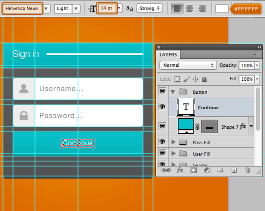 Apply the layer style to the text

Step 15:
Now the last, Add the text below the button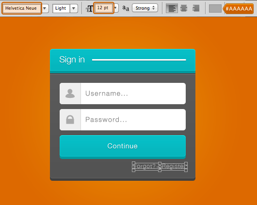
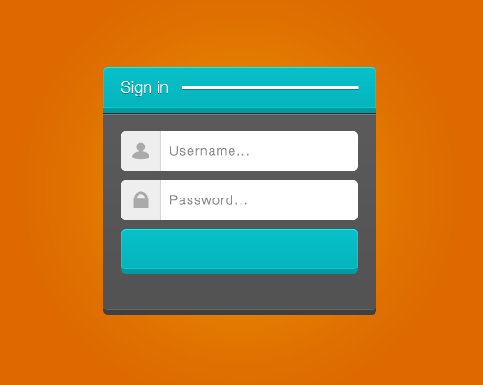
Conclusion
The point from this tutorial is the spacing between elements. So the first things I made was to prepare the guides which will assist and accelerate the process of making this login form. So that is it! I hope this tutorial is useful for you ^_^)/ You might also want to check our previous Photoshop Tutorials:↧
26 Best Photoshop Tutorials of August 2013

Create a Realistic Underwater Scene in Photoshop
 by Thiago Storino
This tutorial will explain how to create an Underwater scene in Photoshop using several stock photographs.
by Thiago Storino
This tutorial will explain how to create an Underwater scene in Photoshop using several stock photographs.
How To Make a Letterpress Texture Effect in Photoshop
 by Chris Spooner
This tutorial will show you a quick and easy way to give your logos and typography that ink stamp style effect that originated from the old letterpress style printing technique.
by Chris Spooner
This tutorial will show you a quick and easy way to give your logos and typography that ink stamp style effect that originated from the old letterpress style printing technique.
Create a Summer Inspired 3D Text Effect in Photoshop
 by Tony Aube
In this tutorial, we will show you how to create a summer inspired 3D text effect. In the process, you will learn how to use Photoshop’s 3D features to create the basic text shape and then combine it with various images in order to achieve a desired result.
by Tony Aube
In this tutorial, we will show you how to create a summer inspired 3D text effect. In the process, you will learn how to use Photoshop’s 3D features to create the basic text shape and then combine it with various images in order to achieve a desired result.
Create a Thor-inspired text effect in Photoshop
 by Alan Kim
In this article we’re going to create a text effect inspired by the Thor 2 movie.
by Alan Kim
In this article we’re going to create a text effect inspired by the Thor 2 movie.
Working with Types: Typography Design Tutorial for Beginners
 by Rudolph Musngi
This typography design tutorial will guide you on how to transform boring texts to your advantage. You will learn how to utilize typography for your website, or even for your print needs. This article will extend from web page design, to printing to graphic images.
by Rudolph Musngi
This typography design tutorial will guide you on how to transform boring texts to your advantage. You will learn how to utilize typography for your website, or even for your print needs. This article will extend from web page design, to printing to graphic images.
Create Unique Floating Rock Typography in Photoshop
 by PSDVault
This tutorial will show you the process of Creating this Unique Floating Rock Typography in Photoshop. You will learn a number of brush tricks, image adjustment tips and practice your selection techniques.
by PSDVault
This tutorial will show you the process of Creating this Unique Floating Rock Typography in Photoshop. You will learn a number of brush tricks, image adjustment tips and practice your selection techniques.
Create a 3D Vintage Lightbulb Sign Using Illustrator, Cinema 4D, and Photoshop
 by Peter Tarka
This tutorial will show you on how to create a vintage lightbulb sign using Adobe Illustrator to create and export the basic paths, Cinema 4D to create the 3D render, and Photoshop for post-production.
by Peter Tarka
This tutorial will show you on how to create a vintage lightbulb sign using Adobe Illustrator to create and export the basic paths, Cinema 4D to create the 3D render, and Photoshop for post-production.
How To Make Folding Ruler Font Effect in Photoshop
 by 4-Designer.com
I saw a folding ruler at home, and it inspired me to make the font style with the folding ruler effect. It is quite easier, and I hope you can add your own thought to the operation.
by 4-Designer.com
I saw a folding ruler at home, and it inspired me to make the font style with the folding ruler effect. It is quite easier, and I hope you can add your own thought to the operation.
Font Label Maker in Photoshop
 by PSDDude
This tutorial shows you how to create the punch type effect not only for text but also for any shape. So I really hope you will enjoy following this tutorial and creating your own customized tape font.
by PSDDude
This tutorial shows you how to create the punch type effect not only for text but also for any shape. So I really hope you will enjoy following this tutorial and creating your own customized tape font.
Comprehensive Guide to Working With Video in Photoshop – Animating Text
 by Martin Perhiniak
In this tutorial, we will show you how to use Photoshop’s Timeline Panel to animate Type layers. Let’s get started!
by Martin Perhiniak
In this tutorial, we will show you how to use Photoshop’s Timeline Panel to animate Type layers. Let’s get started!
How To Designing a Metallic Background
 by Daniel Bryant
In this video tutorial, the metallic background pattern is created using the Color Halftone Pixelate filter and then adding layer styles and gradients. Hope it useful for you.
by Daniel Bryant
In this video tutorial, the metallic background pattern is created using the Color Halftone Pixelate filter and then adding layer styles and gradients. Hope it useful for you.
Create a Sticker in Photoshop
 by PSDDude
This tutorial will teach you on how to create an easy sticker effect in Photoshop using non destructive smart objects.
by PSDDude
This tutorial will teach you on how to create an easy sticker effect in Photoshop using non destructive smart objects.
Learn How To Make Photorealistic Price Tag In Photoshop
 by Shaina
In this tutorial, we are going to create a very photo-realistic price tag in our very own Photoshop.
by Shaina
In this tutorial, we are going to create a very photo-realistic price tag in our very own Photoshop.
Create An Epic Fantasy Based Ancient Battleground
 by Antaka Nguyen
In today’s detailed tutorial you’ll learn how to photo manipulate a fantasy battleground. You’ll work with cool lighting effects, some serious blending, and matte painting techniques.
by Antaka Nguyen
In today’s detailed tutorial you’ll learn how to photo manipulate a fantasy battleground. You’ll work with cool lighting effects, some serious blending, and matte painting techniques.
Using Photoshop to Create Digital Gobos
 by Mark S Johnson
A gobo is a physical template made from glass, metal, or plastic that can be slipped inside (or placed in front of) a light source to produce a bright or dark shape, such as simulated window light or a tree’s shadow. In this tutorial, you’ll create a simple, but elegant, window-shaped gobo.
by Mark S Johnson
A gobo is a physical template made from glass, metal, or plastic that can be slipped inside (or placed in front of) a light source to produce a bright or dark shape, such as simulated window light or a tree’s shadow. In this tutorial, you’ll create a simple, but elegant, window-shaped gobo.
The Process of Creating the “Ascending Spirit” Digital Art in Photoshop
 by PSDVault
This intermediete tutorial, will show you the process of I used to create this ”Ascending Spirit” Photo Manipulation in Photoshop. Along the way, you will practice a number of photo manipulation techniques such as image adjustment, layer blending, texturing, as well as some brush painting skills.
by PSDVault
This intermediete tutorial, will show you the process of I used to create this ”Ascending Spirit” Photo Manipulation in Photoshop. Along the way, you will practice a number of photo manipulation techniques such as image adjustment, layer blending, texturing, as well as some brush painting skills.
Start Your Journey Into the Imaginative World of Matte Painting
 by Santhosh Rao
Matte painting is a great skill for any creative to have. It’s a really effective way to learn skills like photo manipulation and blending, all whilst honing your ‘realism’ skills. In this tutorial, you’ll be creating this scenic, cinematic looking landscape, by combining a lot of different source files.
by Santhosh Rao
Matte painting is a great skill for any creative to have. It’s a really effective way to learn skills like photo manipulation and blending, all whilst honing your ‘realism’ skills. In this tutorial, you’ll be creating this scenic, cinematic looking landscape, by combining a lot of different source files.
Create This Striking Fairy Tale Photo Manipulation in Photoshop
 by Jarka Hrnčárková
This tutorial will show you techniques such as creating a breathtaking landscape from multiple photos, adding dramatic rays of light, and using foreground/middleground/background to create an interesting scene.
by Jarka Hrnčárková
This tutorial will show you techniques such as creating a breathtaking landscape from multiple photos, adding dramatic rays of light, and using foreground/middleground/background to create an interesting scene.
Create Intriguing Manipulation by Mixing Nature and Grunge Elements in Photoshop
 by PSDVault
This tutorial will show you the process of creating this create an intriguing manipulation by mixing nature and grunge elements in Photoshop.
by PSDVault
This tutorial will show you the process of creating this create an intriguing manipulation by mixing nature and grunge elements in Photoshop.
How to Create a Breathtakingly Artistic Winter Horse Illustration in Photoshop
 by Dariusz Markiw
Learn how to create this amazing photo manipulation with a variety of blending techniques, custom brushes, and more. This intermediate-advanced tutorial also comes with its own set of raw ink splatter scans so that you can practice creating your own Photoshop brushes.
by Dariusz Markiw
Learn how to create this amazing photo manipulation with a variety of blending techniques, custom brushes, and more. This intermediate-advanced tutorial also comes with its own set of raw ink splatter scans so that you can practice creating your own Photoshop brushes.
How to Create a Mountainous Matte Painting in Photoshop
 by Jenny Le
This tutorial will show you how create our own mountain scene by arranging multiple stocks together and blending them correctly using layer masks and adjustment layers. You will also learn effective techniques for adding waterfalls and mist.
by Jenny Le
This tutorial will show you how create our own mountain scene by arranging multiple stocks together and blending them correctly using layer masks and adjustment layers. You will also learn effective techniques for adding waterfalls and mist.
Make A Wolverine Movie Poster
 by 4-Designer.com
This tutorial will show you a detail steps to create your own Wolverine movie poster using Photoshop.
by 4-Designer.com
This tutorial will show you a detail steps to create your own Wolverine movie poster using Photoshop.
How to Design a Retro Grunge Poster in Photoshop
 by Rajni Setia
This tutorial will show you how to design a retro grunge poster using Adobe Photoshop. If you are a newbie and wish to create a stunning retro grunge poster then here’s the smart solution. Simply follow the steps listed below and see the results.
by Rajni Setia
This tutorial will show you how to design a retro grunge poster using Adobe Photoshop. If you are a newbie and wish to create a stunning retro grunge poster then here’s the smart solution. Simply follow the steps listed below and see the results.
Make a 3D packaging mockup in Photoshop (Video)
") by Rebecca Creger
In this video tutorial, we’re going to show you how to make a simple 3D mockup of a box in Photoshop.
by Rebecca Creger
In this video tutorial, we’re going to show you how to make a simple 3D mockup of a box in Photoshop.
How To Photoshop a Face Into a Banana Picture
 by Aaron
Have you ever wondered if you can photoshop a person face into a picture without too much photoshop knowledge? In this funny photoshop tutorial for beginner, you will learn how to create banana sculptures with the help of Photoshop!
by Aaron
Have you ever wondered if you can photoshop a person face into a picture without too much photoshop knowledge? In this funny photoshop tutorial for beginner, you will learn how to create banana sculptures with the help of Photoshop!
Photoshop New Ways with Gradient Effect
 by 4-Designer.com
Have you noticed that the normally seen gradient effects lack novelty? Actually, just a little bit skills can achieve unexpected effects.
by 4-Designer.com
Have you noticed that the normally seen gradient effects lack novelty? Actually, just a little bit skills can achieve unexpected effects.
↧